
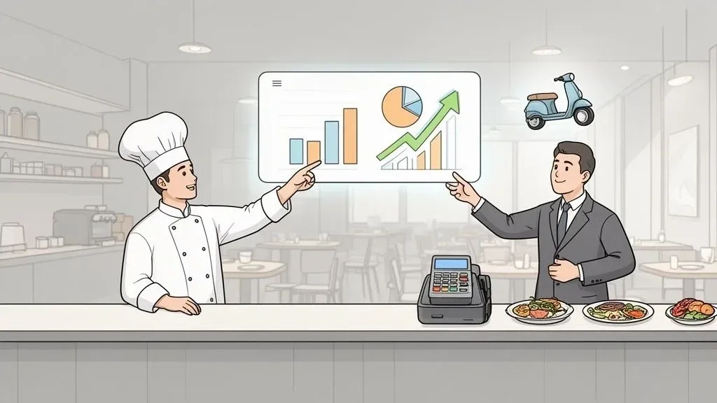
What if you could know your busiest hours before they start? Or pinpoint the sleeper hits on your menu that are quietly driving profits? Imagine knowing exactly which delivery app brings in your most valuable customers, saving you thousands in commissions.
This isn’t wishful thinking; it’s the reality of data analytics for restaurants. In simple terms, it means taking all the information your restaurant creates—from every dine-in meal to every delivery order—and using it to make smarter, more profitable decisions.
Why Data Is Your Restaurant’s New Secret Ingredient
For decades, restaurateurs ran their businesses on gut feelings. It worked, but it was like navigating without a map. Today, technology gives you a GPS. Data analytics for restaurants is that GPS, allowing you to shift from guesswork to data-backed growth. It helps you fine-tune everything from staff schedules to inventory, directly impacting your bottom line.
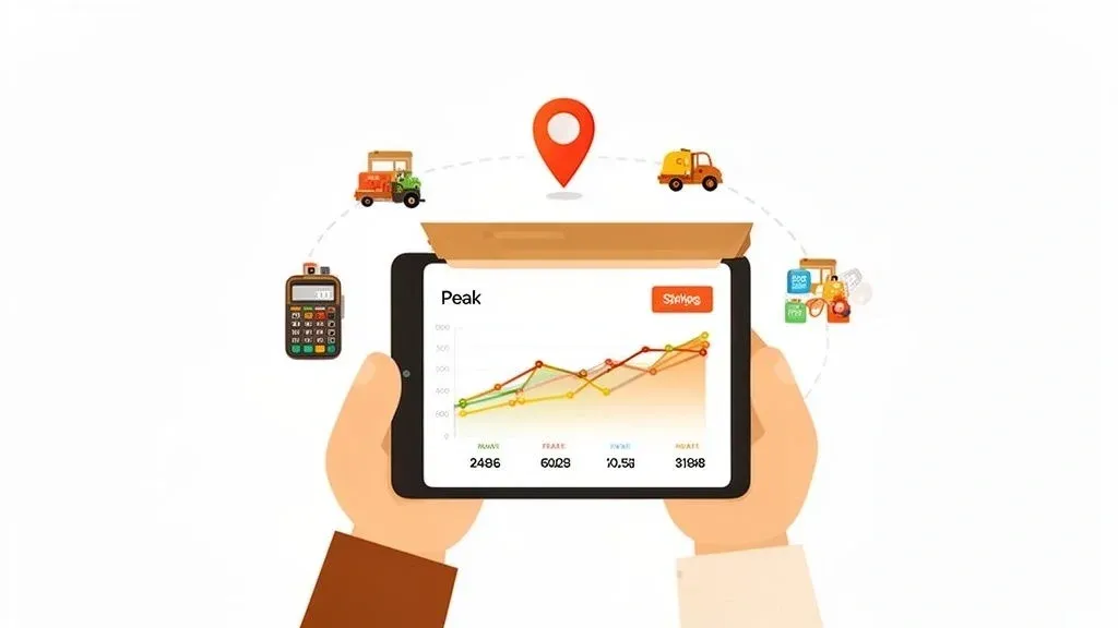
This isn’t just a fleeting trend—it’s a core operational shift. The real magic happens when you integrate data from all your revenue streams, especially your point-of-sale (POS) system and third-party delivery apps like Uber Eats and DoorDash.
Unifying Your Data for Clearer Insights
Here’s a problem every restaurant operator knows: your most valuable data is trapped in separate silos. Your dine-in sales live in your Clover or Square POS, while your delivery orders are spread across multiple tablets. This creates massive blind spots, making it impossible to get a true, complete picture of your business.
Data analytics breaks down these walls. Technically, this is achieved through POS integration, which connects your systems to create a single, unified view of your operations. Suddenly, you can answer the questions that really matter:
- Which dishes are my top sellers on DoorDash versus for in-house diners?
- Is my Friday night revenue coming more from walk-ins or Uber Eats orders?
- How can I schedule my staff to perfectly match predictable delivery rushes?
Why it matters: Seeing all your order information in one place turns fragmented data into a strategic asset. It leads to significant error reduction, more efficient staffing (saving on labor costs), and smarter inventory management (slashing food waste). You can dive deeper into how to use your restaurant menu data to boost profits.
Ultimately, the goal is to stop reacting to yesterday’s problems and start proactively shaping tomorrow’s success. When you embrace data, you’re building a powerful competitive advantage.
Practical Takeaway: Your journey into data-driven restaurant management begins with consolidating your orders. This creates the clean, reliable data foundation you need for everything else. You can start onboarding for Free in a few clicks on the OrderOut Dashboard.
Building Your Central Data Hub with Restaurant POS Integration
Your restaurant is already swimming in valuable data. The problem is, it’s scattered everywhere—locked inside your Point-of-Sale (POS) system and fragmented across a half-dozen different delivery apps. To make any sense of it, you first have to bring it all together.
This process is called POS integration, and it’s the bedrock of any smart data strategy. Without it, you’re stuck in a familiar, chaotic routine: your counter is cluttered with tablets for DoorDash, Uber Eats, and Grubhub, all dinging at once. For every single order, a staff member has to stop what they’re doing and manually punch the details into your POS. It’s a slow, frustrating process that’s practically designed to create errors.
Automating Your Order Flow for Clean Data & Efficient Restaurant Operations
The whole point of POS integration is to get rid of that manual step entirely. It creates an automated bridge between your delivery apps and your POS. When an order comes in online, it flows directly into your system without anyone having to lift a finger.
Why it matters: Integrating your delivery channels with your POS is the single most important thing you can do for your restaurant’s efficiency. It ends the “tablet hell” for good, eliminating the manual entry that causes operational headaches, messes up your sales reports, and pulls staff away from paying customers. This directly improves staff productivity and reduces costly errors.
Real-world example: Think of a busy pizzeria that uses a Clover POS. With an integrated system, an order for a large pepperoni pizza from Uber Eats instantly appears in the POS. The ticket prints directly in the kitchen, just like an in-house order. The sale is recorded perfectly, the kitchen gets the right order immediately, and front-of-house staff can focus on guests. This simple change creates a single source of truth—one clean, reliable dataset where every sale from every channel is accounted for.
Want to dig deeper into this foundational step? Check out our detailed guide on the benefits of POS software integration.
Comparing Manual vs. Integrated Data Collection
When you see the day-to-day operational differences side-by-side, it becomes obvious why integration is no longer a “nice-to-have.” It’s what separates a restaurant that’s just surviving from one that’s set up to grow.
Manual vs. Integrated Data Collection
Operational Task Manual Entry Method (The Old Way) Integrated System (The Smart Way) Order Entry Staff manually types orders from multiple tablets into the POS, risking errors on every order. Orders appear automatically in the POS, saving time and guaranteeing accuracy. Staff Productivity Employees are constantly pulled away from customers to deal with ringing tablets. Staff can focus entirely on preparing food and serving in-house guests, improving service. Sales Reporting Data is often flawed due to missed orders, typos, and entry backlogs. All sales are captured perfectly in real-time, giving you a 100% accurate view of your business. Menu Management To 86 an item or change a price, someone has to log into each delivery app separately. Changes made once in your POS can sync automatically across all of your online menus.
Practical Takeaway: The most practical first move is to connect your delivery platforms to your POS system, such as using a solution like OrderOut for your Square POS. This step alone will immediately improve your operations, save your staff countless hours, and give you the clean, reliable data you need to start making real improvements.
Tracking the Metrics That Actually Drive Restaurant Growth
So, you’ve managed to get all your data flowing into one place. Now what? The big question is what you should actually be tracking. Looking at total sales is a start, but that number only tells you what happened, not why. Real growth comes from digging into the Key Performance Indicators (KPIs) that reveal the story behind your sales.
It’s easy to get lost in a sea of numbers. A metric is just a data point (e.g., “100 burgers sold”). A KPI is a metric that is tied to a specific business goal (e.g., “Cost per Burger Sold” to measure profitability). It’s crucial to have a clear understanding of KPI vs metrics. Getting this level of insight requires a unified view of your operations, where data from all your different channels feeds into a single system.
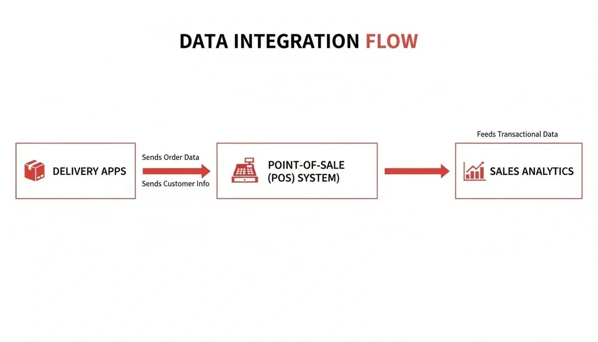
This integrated flow is the foundation. It’s how you turn a jumble of raw numbers from your POS and delivery apps into smart, profitable decisions for your restaurant.
Menu Engineering Your Path to Profitability
One of the most powerful things you can do with your integrated data is menu engineering. This isn’t just about picking out your best-sellers. It’s a proven method for analyzing the popularity and profitability of every single item you sell, sorting each dish into one of four categories:
- Stars: High popularity, high profitability. Promote them everywhere!
- Plowhorses: High popularity, low profitability. Customers love them, but they aren’t making you much money. Tweak the recipe to lower food costs or slightly increase the price.
- Puzzles: Low popularity, high profitability. These are hidden gems. Get more people to order them with better photos, descriptions, or staff recommendations.
- Dogs: Low popularity, low profitability. Be honest—these items are likely taking up valuable menu space. It might be time to let them go.
Why it matters: Menu engineering directly boosts your profit margins without needing to find a single new customer. By connecting delivery and POS data, you might find that your “Spicy Chicken Sandwich” is a Star on DoorDash but a Puzzle for dine-in guests. That single insight helps you focus your marketing efforts where they’ll have the most impact, saving money and boosting sales.
Uncovering Granular Sales & Restaurant Delivery Trends
Once your data is connected, you can move beyond knowing that “Fridays are busy” and start uncovering actionable details that were impossible to see before.
Real-world example: A burger joint using its Square POS integration notices a huge spike in orders between 12 PM and 2 PM on weekdays. Digging deeper, they see those orders are coming almost exclusively from Uber Eats and are being delivered to a nearby office park. This is the kind of specific insight that changes the game. The manager can now confidently schedule more kitchen staff just for the weekday online order rush, improving efficiency and staff productivity.
For a deeper dive into the numbers you should be watching, check out our guide to the most important KPIs for a restaurant.
Practical Takeaway: Pull up your POS reports and look at your sales by the hour for the last week. Pinpoint your top three busiest hours. Now, see which platform—in-house, DoorDash, or another app—is bringing in the most business during those peaks. This is your first step toward making smarter, data-driven decisions about staffing and marketing.
Optimizing Restaurant Operations and Food Tech with Data
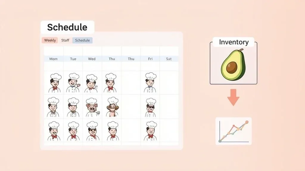
This is where data analytics truly transforms your restaurant. Once your data is all in one place, you stop putting out fires and start preventing them. You move from reacting to problems to actually getting ahead of them, which makes a huge difference in how smoothly your kitchen runs and, most importantly, how much money you keep.
Fine-Tuning Your Inventory to Eliminate Food Waste
Food waste is a notorious profit-killer. Every spoiled ingredient is cash thrown away. The good news is, your own data holds the key to stopping the bleed.
By looking at the combined order data from your in-house Square POS and your delivery apps, you can ditch the “just-in-case” ordering habit. Technically, you can use historical sales velocity to forecast future demand with surprising accuracy—a concept known as predictive analytics.
Why it matters: Let’s say your sales data reveals a consistent 30% spike in avocado toast and guacamole orders every Saturday. With that specific number, you know exactly how much to bump up your avocado order for the weekend. This leads to direct cost savings from reduced food waste, fewer errors (no more 86’ing a popular item), and a more productive kitchen.
Smarter Scheduling for Peak Restaurant Operations
After food, labor is your biggest expense. Overstaffing eats into your margins, while understaffing burns out your team and tanks the customer experience. Data-driven scheduling turns this weekly puzzle into a strategic tool.
You might see that while Tuesday dine-in service is slow, you get slammed with delivery orders between 6:00 PM and 8:00 PM. Armed with that insight, you can schedule one fewer server for the floor but add an extra pair of hands in the kitchen for those two hours. You’re aligning your labor spend with your actual revenue sources, hour by hour.
When your systems are connected—like linking your Clover POS data with your delivery platforms—this level of detail becomes easy to see. Once you master this, you can explore even more efficiencies by learning how automation in restaurants can help.
Practical Takeaway: Pull up your item sales report from the last 30 days. Find your top three best-sellers and your bottom three worst-performers. This simple exercise is your first step toward making a smarter, data-backed decision for your menu and inventory. You can begin by onboarding for Free in just a few clicks at the OrderOut Dashboard.
How to Build a Long-Term Competitive Edge
Building a real, lasting advantage isn’t about buying the latest tech toy; it’s about getting good at reading the story your own data is telling you. This mindset shift moves you from just fixing yesterday’s problems to actively building a more profitable tomorrow.
The top performers aren’t just looking at sales totals. They’re using consolidated insights from their POS and delivery channels to create smarter pricing, build loyalty programs that actually work, and innovate their menus with confidence. You can read our guide on creating a dynamic price strategy to see exactly how this works.
From Tools to Talent: A Strategic Shift
The real magic of restaurant analytics happens when you stop treating it like a separate task and make it a core part of your business strategy. It means teaching your team how to read the numbers and—most importantly—how to turn those numbers into action.
When you bring every data point together—from an Uber Eats order to a walk-in payment on a Clover terminal—you get a complete, 360-degree view of your business. This unified dataset becomes your secret weapon, helping you spot long-term trends and make smart moves that keep you ahead of the curve. Discover more about the strategic shifts reshaping the restaurant industry.
Why it matters: Treating your consolidated data as a strategic asset unlocks the ability to make forward-thinking decisions that directly impact your bottom line. It’s how you identify long-term trends in customer behavior and operational efficiency before your competitors do, ensuring your restaurant thrives, not just survives.
Unifying Data for a Complete Business Picture
Think about having a single, clean source of truth that contains every order from every channel. This is completely possible with the right POS integration. For example, connecting your delivery apps directly into a Square POS system does exactly this.
Getting this complete picture allows you to:
- Identify long-term trends: See exactly how customer tastes change with the seasons.
- Make forward-looking decisions: Invest confidently in new menu items because you have the data to back it up.
- Outmaneuver the competition: Spot and jump on emerging delivery opportunities before anyone else.
Practical Takeaway: The single most powerful action you can take right now is to bring all your order data into one place. Stop collecting random bits of information and start building a real asset. You can start onboarding for Free in a few clicks to begin creating your unified business picture today.
Your First Step to Data-Driven Decisions
All this talk about data can feel overwhelming, but the first step is surprisingly simple. Forget about complex spreadsheets and algorithms for a moment. The single most important thing you can do right now is get all your scattered data into one place.
Think about the chaos of a busy service. You have orders coming in from multiple delivery tablets, and your staff is frantically punching them into your POS. It’s not just slow—it’s a recipe for costly mistakes that pollute your sales data, making it unreliable.
Automate Your Order Flow
Before you can analyze a single report, your data needs to be clean. The most practical, immediate way to achieve this is by automating your order flow with POS integration. This single change builds the accurate foundation you need for real analysis.
Picture this: The dinner rush is on, but there’s no frantic tablet-juggling. An order from Uber Eats appears directly in your Clover POS kitchen printer. A moment later, a DoorDash order syncs perfectly with your Square system. The immediate error reduction and boost in staff productivity are game-changers, saving time and money from day one.
Once all your orders flow through one central hub, you can finally trust the numbers. You can confidently track key metrics and start making small, informed changes that have a huge impact on your bottom line.
Practical Takeaway: Don’t wait to build a more efficient and profitable restaurant. The journey begins by connecting your delivery apps and POS system. You can start that process right now. Get started for free in just a few clicks and begin unifying your data today.
Frequently Asked Questions
Diving into data can feel like a huge undertaking, especially when you’re busy running a restaurant. Let’s clear up a few common questions we hear from operators who are just starting to explore what analytics can do for them.
I’m Not a Tech Expert. Where Do I Even Begin with Data Analytics?
You definitely don’t need a degree in data science. The best first step is to get your systems to talk to each other. Simply start by integrating your delivery platforms, like Uber Eats and DoorDash, directly with your POS system.
This single connection gets rid of the manual task of punching in online orders. It instantly cuts down on errors and, more importantly, starts building a clean, unified source of truth for all your sales. Tools that connect with a Clover or Square POS can set this up for you automatically.
What’s the Single Most Important Metric for Restaurant Delivery?
If you only track one thing for your delivery channels, make it Net Profit Per Order. It’s easy to get distracted by big revenue numbers, but that doesn’t tell you what you’re actually taking home.
To figure this out, you have to subtract all related costs from each order’s total price, including:
- Commission fees charged by the delivery app
- The Cost of Goods Sold (COGS) for the ingredients
- Any special packaging costs you only use for delivery
Why it matters: This number tells you which delivery platform is truly your most profitable partner. Real-world example: DoorDash might bring in more total revenue, but if Uber Eats has lower fees and customers who order higher-margin items, it might be your more valuable channel. Knowing this helps you focus your marketing budget where it counts.
How Can Data Analytics Help Lower My Food Costs?
Analytics moves your inventory management from a guessing game to a precise, cost-saving strategy. By looking at the sales data flowing from your integrated POS, you can see exactly which dishes are selling, how many are sold, and when they’re most popular. This insight lets you build incredibly accurate purchasing orders.
Why it matters: This shift away from “gut-feel” ordering dramatically cuts down on over-stocking ingredients that don’t move, a huge source of spoilage and wasted money. This directly lowers your food costs, reduces prep waste, and improves your bottom line.
Ready to stop guessing and start making decisions backed by your own data? OrderOut can connect your delivery apps and POS in just a few minutes, giving you the clean, consolidated numbers you need to improve efficiency and profitability.