
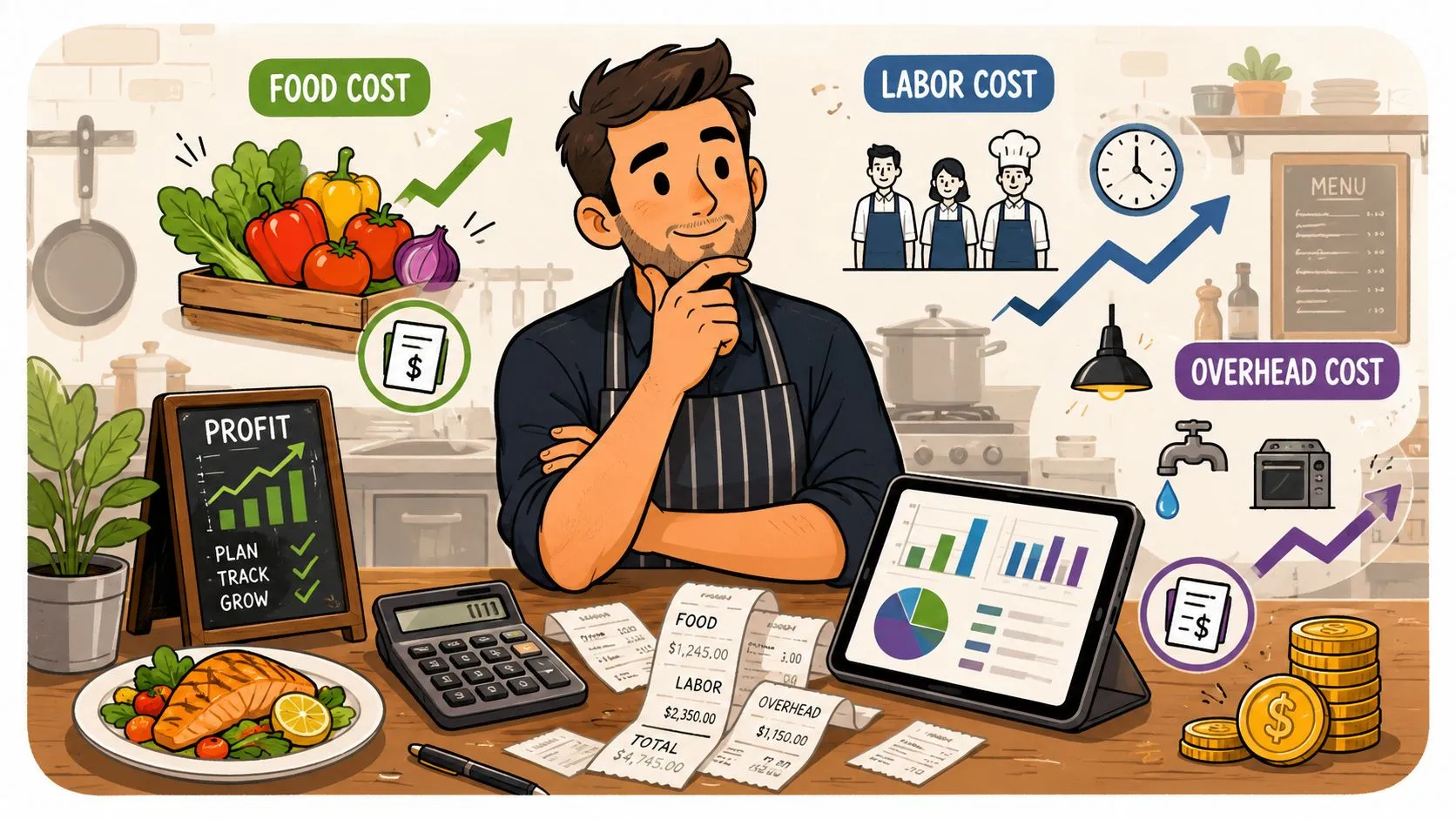
Restaurant cost analysis is the habit of measuring what a restaurant spends to produce each sale, then comparing that spend to revenue so you can see where profit is leaking. The part most owners miss is that the clean-looking food-cost number on a P&L can hide waste, portion drift, and channel-specific losses that only show up when you reconcile what should’ve been used with what disappeared.
What a Restaurant Cost Analysis Is
Restaurant cost analysis is a management routine, not a once-a-year accounting exercise. It pulls together food, labor, packaging, commissions, and overhead, then checks those costs against sales so you can tell whether the business is earning its keep.
The useful distinction is simple. Bookkeeping records what happened, tax accounting classifies it, and cost analysis shows what needs attention next. If you run a restaurant, the point is not just to know your numbers, it is to know which numbers are drifting, which ones you can control, and which ones are eating margin.
What operators should expect from the process
A solid review starts with the menu, not the bank account. You cost recipes by standardized portion, compare theoretical food cost with actual food cost, and then reconcile period COGS with the sales mix that created it, which is the same practical framing used in a restaurant profit and loss statement example.
The reason this matters is that the same sales volume can produce very different profit outcomes depending on execution. A kitchen that portions well, buys consistently, and keeps menu data clean will look very different from one that runs on guesswork, even if both show similar revenue.
The gap is where the money hides. Hidden waste and portion drift can widen the gap between theoretical and true cost, and third-party delivery channels can change contribution margin on the same menu item without changing the item itself. That is why I also look at KPI tracking for restaurants and hotels alongside the P&L review, because the menu item, the channel, and the labor pattern often move together.
Practical rule: if you can’t explain the gap between what food should have cost and what it really cost, you don’t really know your cost structure yet.
Keep the rhythm tight. Weekly or bi-weekly checks are usually enough to catch the problems that matter, and they are far more useful than waiting for a month-end surprise. The goal is a repeatable routine, not a heroic close look every quarter.
The Core Cost Metrics Every Operator Should Track
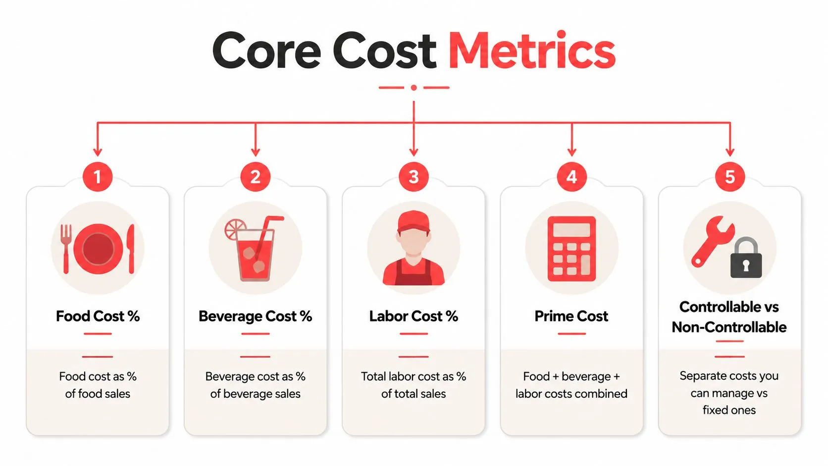
Food cost percentage
Food cost percentage tells you how much of your food sales went back out the door to buy ingredients. The formula is food cost ÷ food sales × 100. If that number drifts, something changed in purchasing, yield, portioning, or waste.
Beverage cost percentage
Beverage cost percentage does the same job for drinks. Use beverage cost ÷ beverage sales × 100. It matters because beverage programs can mask sloppy controls elsewhere if you only look at blended sales.
Labor cost percentage
Labor cost percentage shows how much of total sales is being consumed by payroll and related labor costs. The formula is total labor cost ÷ total sales × 100. It becomes useful when you compare it across periods, dayparts, and service styles instead of treating it like a single scoreboard number.
Prime cost
Prime cost is the big one because it combines the two most controllable areas of the business, food and labor. In plain language, it tells you how much of each sales dollar is already spoken for before rent and everything else show up. The formula is food cost + beverage cost + labor cost, then divided by sales when you want the ratio.
COGS
COGS, or cost of goods sold, is the inventory math underneath the menu. Use Beginning Inventory + Purchases - Ending Inventory to calculate it for the period, then compare that number to food sales or beverage sales depending on the category. For a broader framework on KPI tracking, a useful external reference is KPI tracking for restaurants and hotels, especially if you’re trying to tie cost data to the rest of the operation.
Operator takeaway: these ratios only matter when they move over time, and when you can connect that movement to the room, the menu, and the channel.
I also keep a simple habit in mind, compare the same metric by week, by month, and by sales channel. A clean number in one period can still hide a bad trend if you only look once.
For a tighter grasp on the ingredient side of the house, the restaurant food cost percent guide is a useful companion when you’re building or auditing recipe-level math.
Where the Data Lives and How to Pull It
The numbers are usually already in the building. They are just scattered across systems that do not talk to each other cleanly, so the first job is to pull them into one view and check that the counts line up before anyone starts arguing over margin.
Pull sales from the POS first
Start with the POS, because that is where item-level sales should be cleanest. Clover and Square both give you item-level sales data, which shows what sold, when it sold, and how it was categorized. If you run Uber Eats, DoorDash, or Grubhub alongside dine-in and takeout, separate the sales by channel instead of letting them sit in one blended revenue bucket.
That separation only works if the order data is mapped cleanly into the POS. OrderOut’s third-party order engine is built around normalized order mapping, which matters because bad mapping turns channel reporting into a mess fast.
Add marketplace and back-office records
Delivery platforms bring their own order counts, ticket sizes, commission fees, and refunds, and those reports are where the channel math lives. Use them to see what each channel produced, not just what hit the top line. On the supply side, invoice and receiving records show what was purchased, while a physical inventory count turns those purchases into COGS.
Payroll exports matter for the same reason. Labor cost is not just hourly wages, it includes the full labor picture you need if you want the numbers to match reality.
If the menu data is stale, the inventory math will not save you. Bad input creates bad analysis, no matter how polished the spreadsheet looks.
If you are on Clover, OrderOut is free to install on the Clover App Market, which keeps the plumbing simpler when delivery channels need to feed the POS instead of sitting outside it.
Before you calculate anything, collect these inputs first, POS sales by channel, marketplace reports, invoices, receiving logs, payroll exports, and a current inventory count. Without that set, you are guessing.
For a broader view of how data should move through the restaurant stack, the restaurant data analytics guide is a good reference point. If you also need a practical way to work out fixed versus variable pressure, you can calculate break even for your studio and use the same discipline on a restaurant P&L.
A Worked Sample Calculation You Can Copy
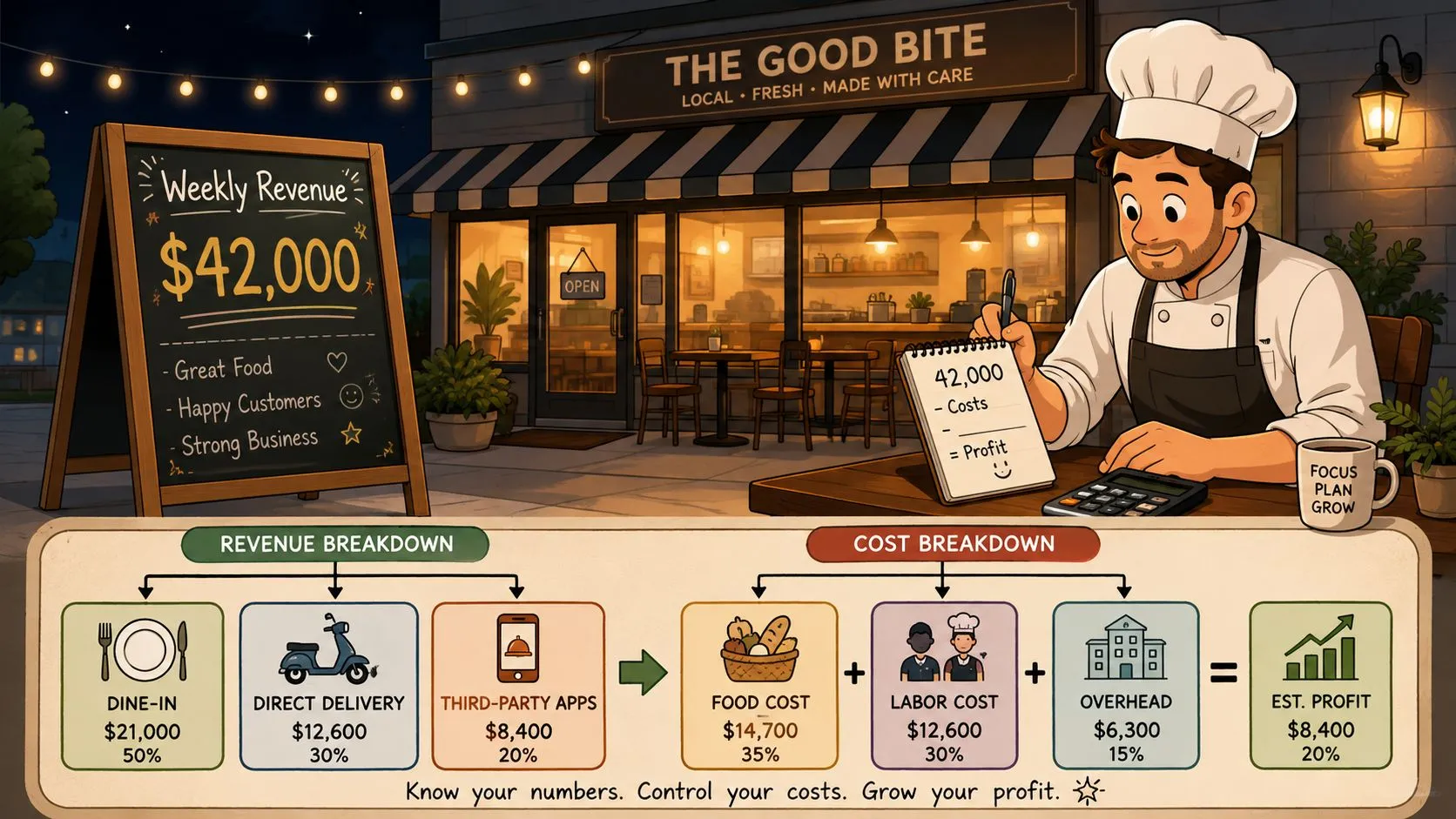
A small independent restaurant doing about $42,000 a week can look healthy on sales and still leak margin if the cost math is sloppy. The point of a worked sample is to show how the pieces fit together, not to force your books into somebody else’s shape.
Start with COGS and food cost
Say the restaurant starts the week with $8,000 in inventory, buys $14,000 more, and ends the week with $7,000 on hand. That gives you $15,000 in COGS using the standard inventory formula. If food sales for that week were $24,000, food cost percentage is the COGS divided by food sales, which is the number you use to judge recipe and purchasing discipline.
The number itself isn’t the insight. The insight is whether the gap reflects waste, spoilage, or portion drift. If the kitchen thinks it portioned correctly but the math disagrees, the issue is usually on the line or in receiving.
Add labor and prime cost
Now say total labor, wages plus payroll taxes and related costs, lands at $12,000 for the same week. That makes the prime cost picture much more honest, because food and labor are the two controllable lines most owners can influence week to week.
For another way to pressure-test the economics of a business, a general break-even calculator reference can help you think about how much fixed cost the operation has to carry before profit shows up.
Then look at channel mix
A chicken sandwich sold in the dining room doesn’t carry the same cost stack as the same sandwich sold through Uber Eats, DoorDash, or Grubhub. In-house sales avoid marketplace commission drag, while third-party tickets often carry extra packaging, more handling, and more remake exposure when an order gets re-keyed from a tablet.
The menu item didn’t change. The contribution margin did.
That’s why a spreadsheet built with categories across the top and weeks down the side works so well. It forces you to compare the same line items repeatedly, and it makes week-over-week drift much easier to spot than a one-off report ever will.
For labor math specifically, the restaurant labor cost calculator is a helpful companion when you’re building your own template.
Why Channel-Level Margins Change the Whole Picture
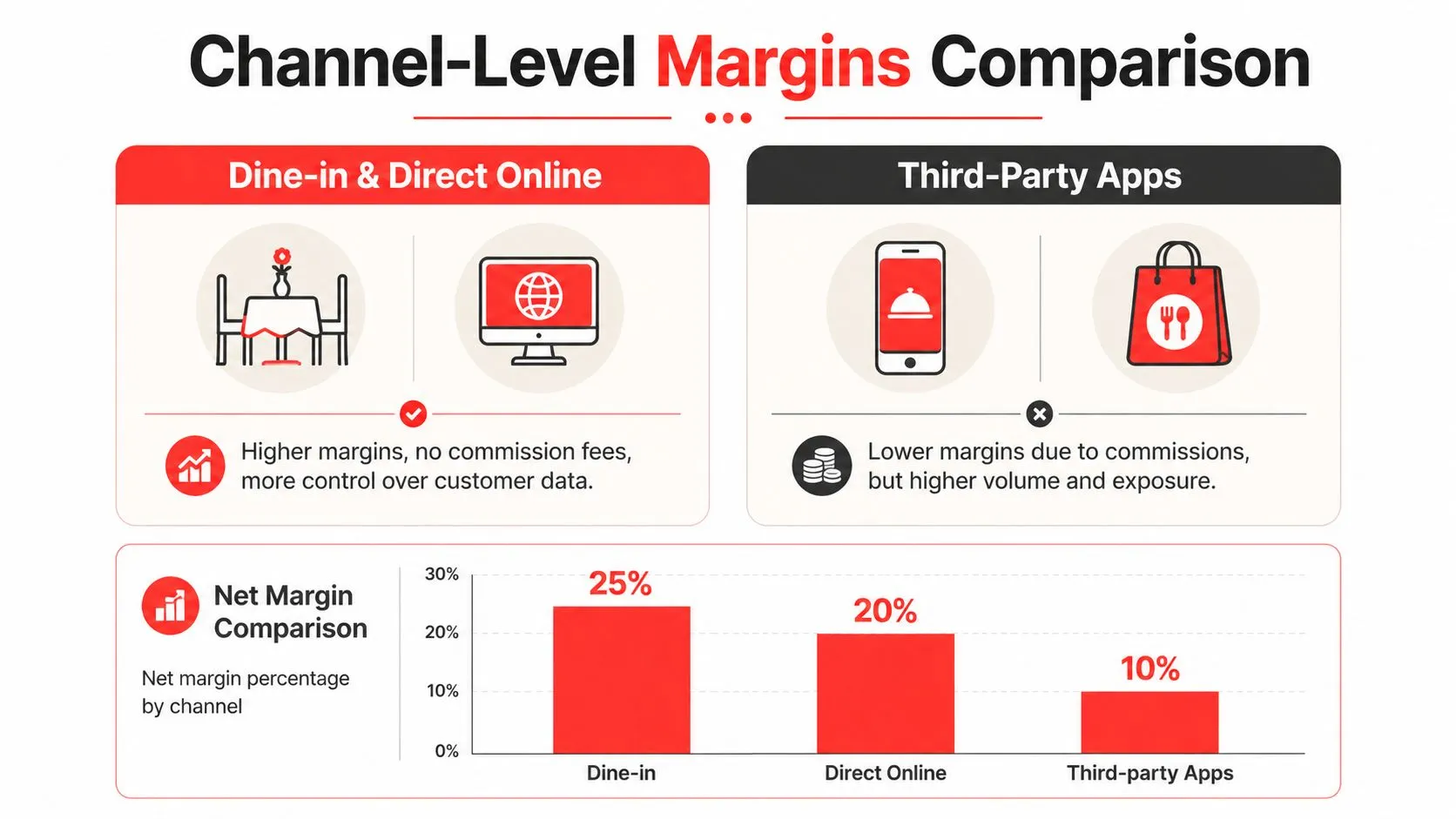
Dine-in, direct online, and third-party delivery are not the same business, even when the menu is identical. The blended P&L makes that look tidy, but tidy isn’t the same as useful.
Third-party orders carry extra cost layers
A delivery ticket through a marketplace can pick up commission drag, packaging cost, remakes, and extra labor in fulfillment. If the restaurant still re-enters those orders by hand from a tablet, the hidden cost is not just labor time, it’s also the error rate that comes from human re-keying.
Direct online ordering changes the stack because the restaurant owns the customer relationship and avoids marketplace commission. That alone can change whether a menu item is attractive or just looks attractive on paper.
Clean data is what makes the math believable
If orders flow straight into Clover or Square from delivery apps through a normalized integration, the channel reports stop fighting each other. That’s the difference between guessing at contribution margin and measuring it.
I’ve seen plenty of operators obsess over food-cost percentage while the core problem sat in the channel mix. A burger can be a strong seller and still underperform after fulfillment costs if the order came through the wrong channel.
The practical question is not whether delivery is good or bad. The key question is which channel and order type leaves the most margin after all the costs are attached.
If you want to dig deeper into reconciling those numbers, the difference reconciliation guide is a useful companion for operators who need cleaner channel-level reporting.
Common Pitfalls and Tactical Ways to Cut Cost
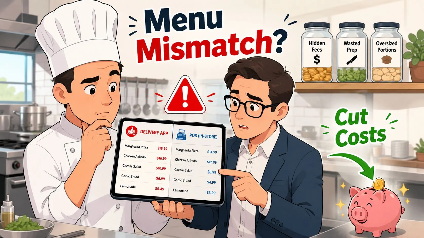
The easiest way to lose margin is to let the menu, the POS, and the delivery apps drift out of sync. Once those systems disagree, the restaurant starts paying for mistakes that never show up clearly in the monthly summary.
Portion drift and hidden waste make the gap wider. A recipe can look fine on paper while line cooks over-portion, prep waste climbs, or a batch is lost because nobody logged it properly. That is the difference between theoretical food cost and what leaves the building.
Fix the things that distort the numbers
Stale menus: keep delivery app menus aligned with the POS so you are not analyzing one version of the business while running another.
Head-chef memory: write recipes down with measured portions. If the recipe lives in someone’s head, the cost control does too.
No inventory cadence: count on a fixed schedule, then compare the count with expected usage. That is how waste and theft stop hiding inside the total.
No waste log: record prep waste, spoilage, and portion creep in a simple format. The system does not need to be complicated, it needs to get used.
Blended reporting: split dine-in, direct online, and marketplace delivery into separate views. One blended pool hides the channel that is dragging.
The most practical fix is order injection into the POS so staff are not re-keying marketplace tickets from separate tablets. On Clover, that starts with the free Clover App Market listing, and Square operators can use the OrderOut Square app listing to reduce manual handling on that side as well.
Tactical rule: if a cost problem keeps repeating, assume a process is broken before you assume the menu item is the villain.
Channel mapping matters too. If the marketplace menu is normalized into the POS schema, managers can stop firefighting and start comparing actual performance by channel. The third-party order engine hub is the right place to understand that structure at a practical level.
Operational mess shows up in back-of-house conditions as well. A clean floor and disciplined routines matter, which is why a resource like pest control for restaurants fits into the broader cost conversation, even though it is often treated as separate from margin control.
The best fixes are the unglamorous ones. Clean the data, standardize the portions, tighten the counts, and make sure every delivery order lands in the POS without re-entry.
Frequently Asked Questions
How often should I run restaurant cost analysis?
Weekly is the most useful cadence for food and labor, because it catches drift before the month closes. A deeper review that includes inventory reconciliation and overhead works well on a monthly rhythm.
Is prime cost more useful than food cost percentage?
Yes, if you want a better snapshot of operational efficiency. Food cost alone can look fine while labor slips, and prime cost keeps both of the biggest controllable lines in view.
How does OrderOut help with cost analysis?
It helps by pushing Uber Eats, DoorDash, and Grubhub orders straight into Clover or Square, which reduces manual re-keying and keeps the order data cleaner. That cleaner flow makes channel-level analysis more believable, especially when you’re comparing direct sales with marketplace delivery.
Does this work for small independent restaurants and multi-unit groups?
It does, because the same cost logic applies at both levels. Smaller operators usually need the discipline more urgently, while multi-unit groups need it to compare locations and standardize what works.
Do I need separate reports for each sales channel?
You do if you want to understand contribution margin. A blended report can hide the channel that looks healthy on revenue but weak after fulfillment costs.
OrderOut connects delivery apps like Uber Eats, DoorDash, and Grubhub directly into the POS, so your team can stop re-keying orders and start trusting the numbers they’re looking at. If you’re trying to tighten restaurant cost analysis, that cleaner channel data is often the difference between guessing and effectively managing margin. Visit OrderOut to see how it fits your operation, then start onboarding free at dashboard.orderout.co.